Photo gallery
-
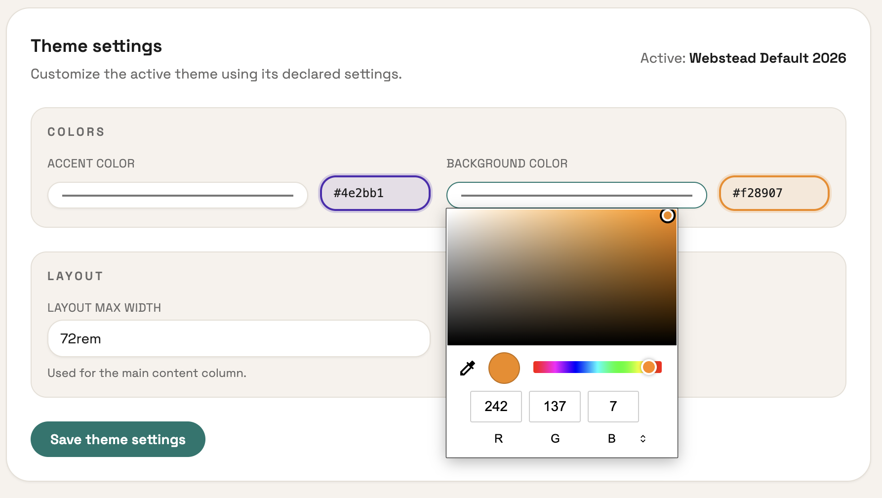
The color glow is such a vibe
I'm implementing custom theme settings! This is something I had the idea for late one night last week. You define the settings you want in your theme's theme.json like this:
{
  ...
  "settings": {
    "fields": {
      "accent_color": {
        "type": "color",
        "label": "Accent color",
        "default": "#cc3f2e"
      },
      "background_color": {
        "type": "color",
        "label": "Background color",
        "default": "#f8f4ef"
      },
      "max_width": {
        "type": "string",
        "label": "Layout max width",
        "default": "72rem",
        "help": "Used for the main content column."
      }
    },
    "groups": [
      {
        "label": "Colors",
        "fields": ["accent_color", "background_color"]
      },
      {
        "label": "Layout",
        "fields": ["max_width"]
      }
    ]
  }
}
The result is the UI you see above! Then they can be used your theme like this:
<style>
    :root {
        --accent: {{ theme.settings.accent_color|default:"#cc3f2e" }};
        --bg: {{ theme.settings.background_color|default:"#f8f4ef" }};
    }
</style>
This seems like a small feature but it gives users and theme devs a ton of flexibility! I'm exicted to someday see how people use it.